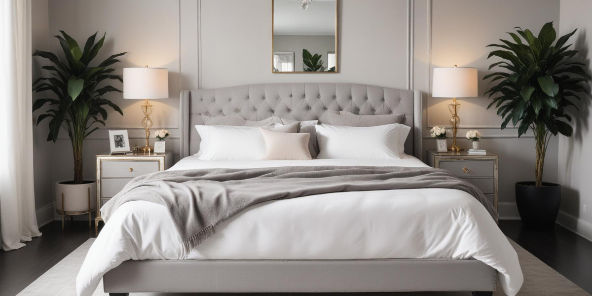
Neutral shades like beige, taupe, and gray offer timeless elegance and versatility. They provide a subtle backdrop that allows your furniture, artwork, and table settings to stand out. Beige and taupe create a warm and inviting atmosphere, perfect for a traditional or transitional dining room. Gray, on the other hand, can range from soft and serene to bold and dramatic depending on the shade and lighting. These colors also pair well with various accent hues, making them a safe yet stylish choice for those who like to change up their decor frequently.
1. Rich, Warm Tones
If you want to create a cozy, intimate dining experience, consider rich, warm colors like deep reds, burgundies, or burnt oranges. These shades evoke a sense of comfort and warmth, making them ideal for spaces where people gather for leisurely meals. Red is known to stimulate appetite and conversation, which is why it’s a popular choice for dining rooms. Pair these warm tones with complementary accents in gold or brass to enhance the room's inviting ambiance.
2. Elegant Blues and Greens
For a more serene and calming dining experience, consider cooler hues like soft blues and greens. These colors create a tranquil environment that can make mealtime feel like a retreat. Light blue and mint green offer a fresh, airy feel that works well in both contemporary and classic settings. For a bolder look, opt for deeper shades like navy or forest green. These colors add depth and sophistication while still maintaining a sense of calmness
3. Bold and Vibrant Colors
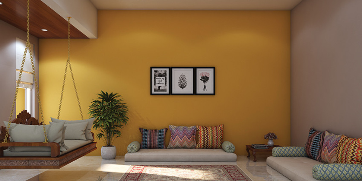
If you’re looking to make a statement, don’t shy away from bold colors like vibrant yellows, deep purples, or electric teals. These energetic hues can inject personality and excitement into your dining space. Yellow, for example, is often associated with happiness and can brighten up even the smallest of rooms. Purple adds a touch of luxury and creativity, while teal provides a refreshing pop of color. When using bold colors, it’s essential to balance them with neutral furnishings and accessories to avoid overwhelming the space.
4. Monochromatic and Accent Walls
For a modern twist, consider a monochromatic color scheme where different shades of the same color create a harmonious look. This approach allows for a sophisticated and cohesive design. Alternatively, you can opt for an accent wall in a contrasting or complementary color. This technique adds visual interest and can highlight a specific area of the room, such as a buffet or artwork display. Accent walls are an excellent way to experiment with bolder colors without committing to an entire room overhaul.
Conclusion
Choosing the right paint color for your dining room involves more than just picking a shade that looks good. It’s about creating an atmosphere that complements your dining experience and reflects your personal style. Whether you go for classic neutrals, rich tones, serene blues and greens, bold colors, or a stylish accent wall, the right color choice will enhance the beauty and functionality of your dining space. Take your time to test samples and consider how different colors interact with your lighting and decor. With the right approach, you’ll transform your dining room into a welcoming haven for all your gatherings.